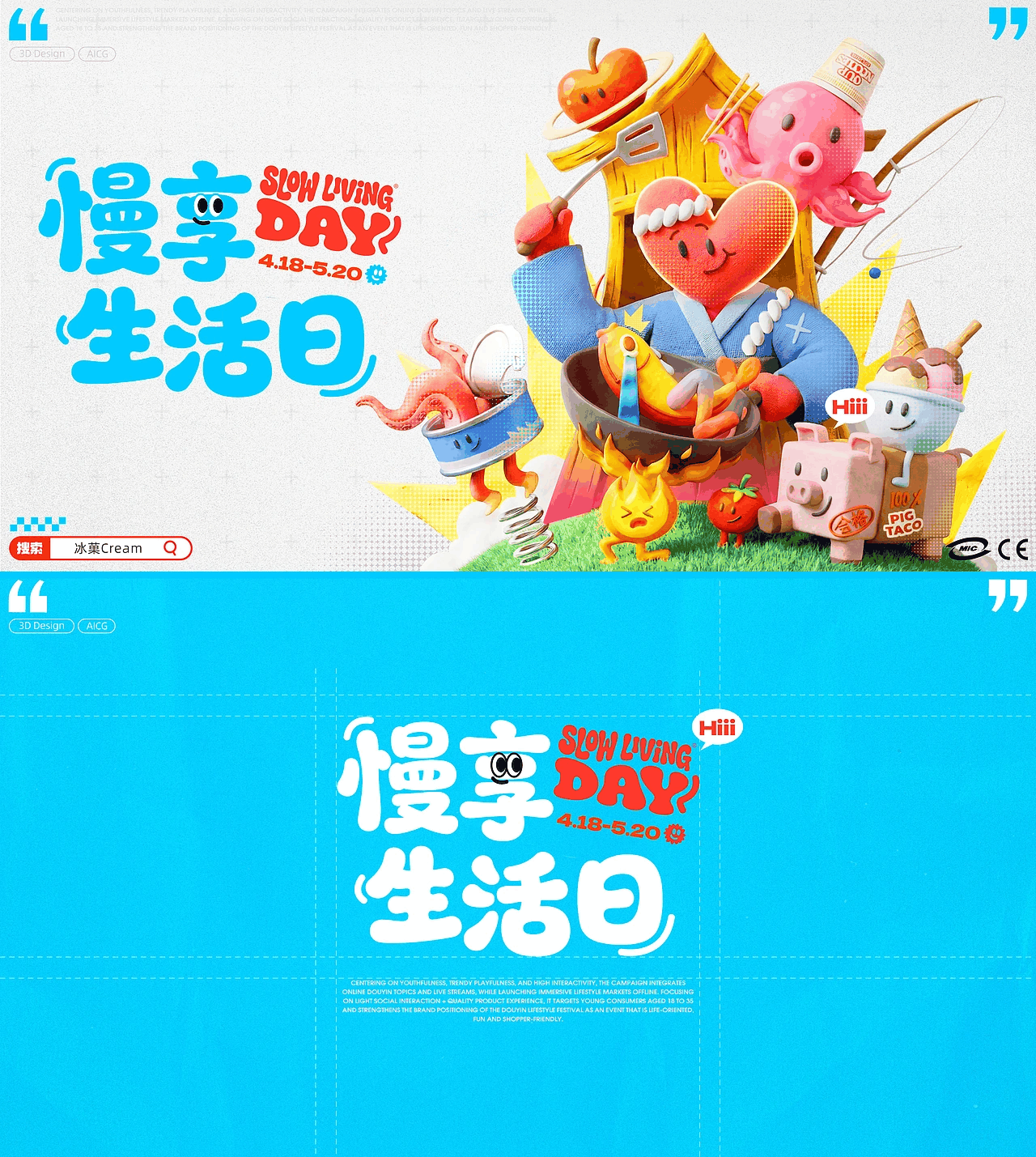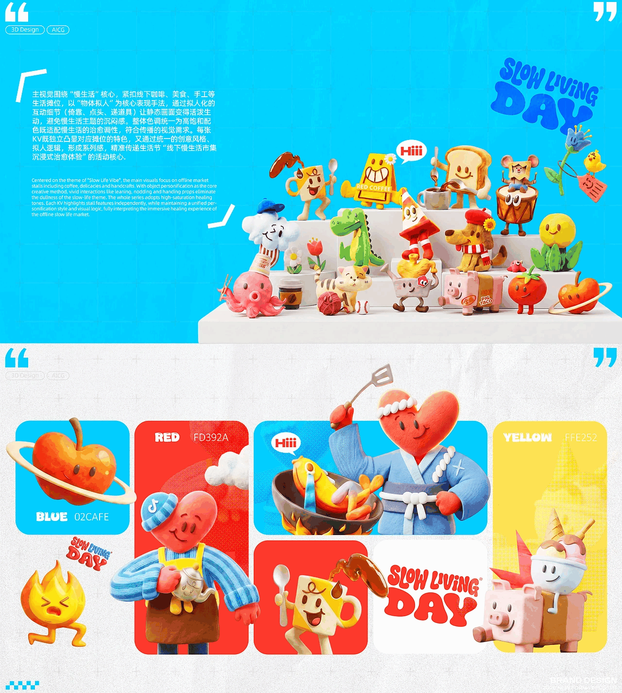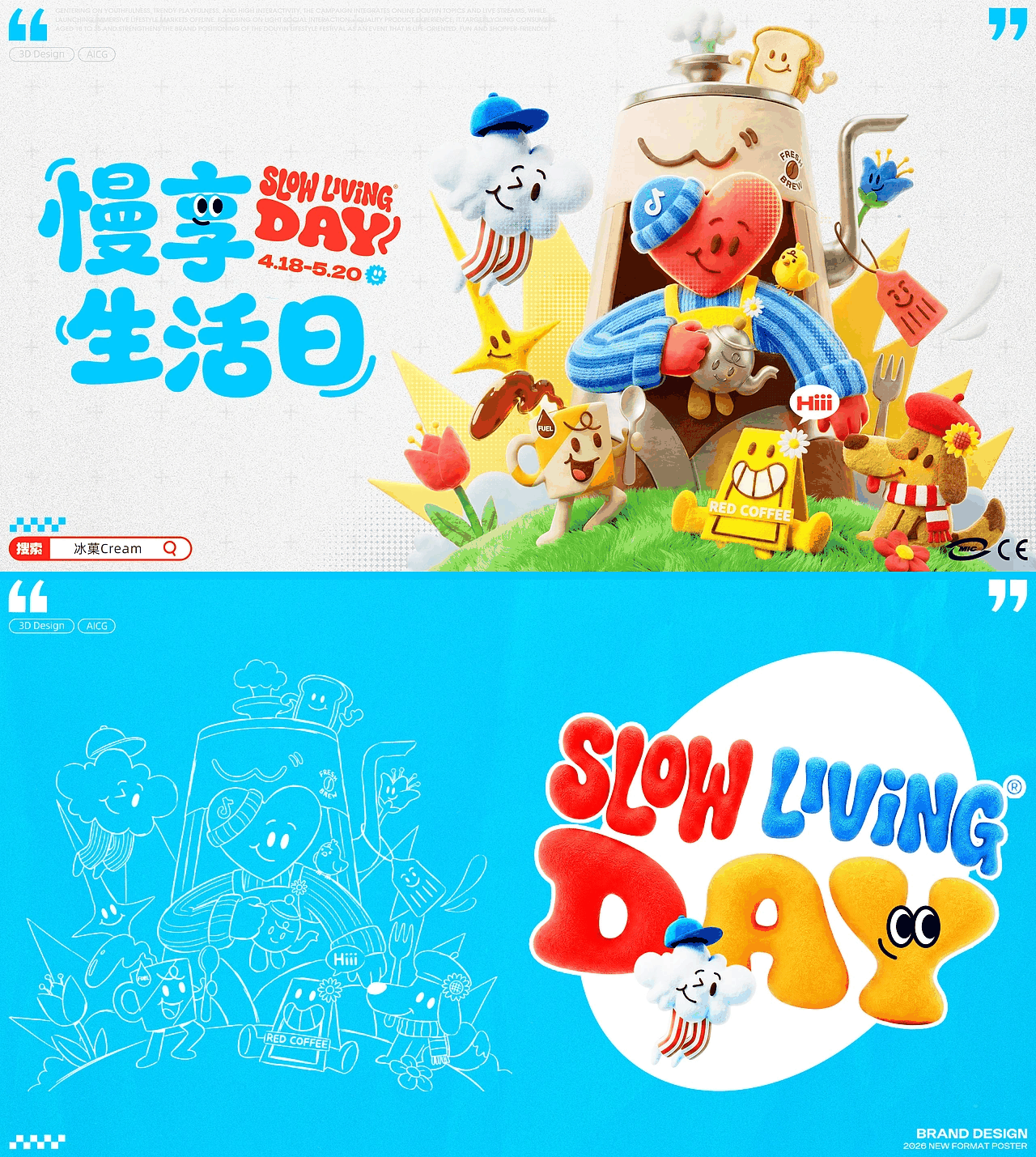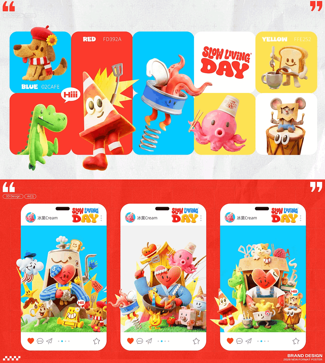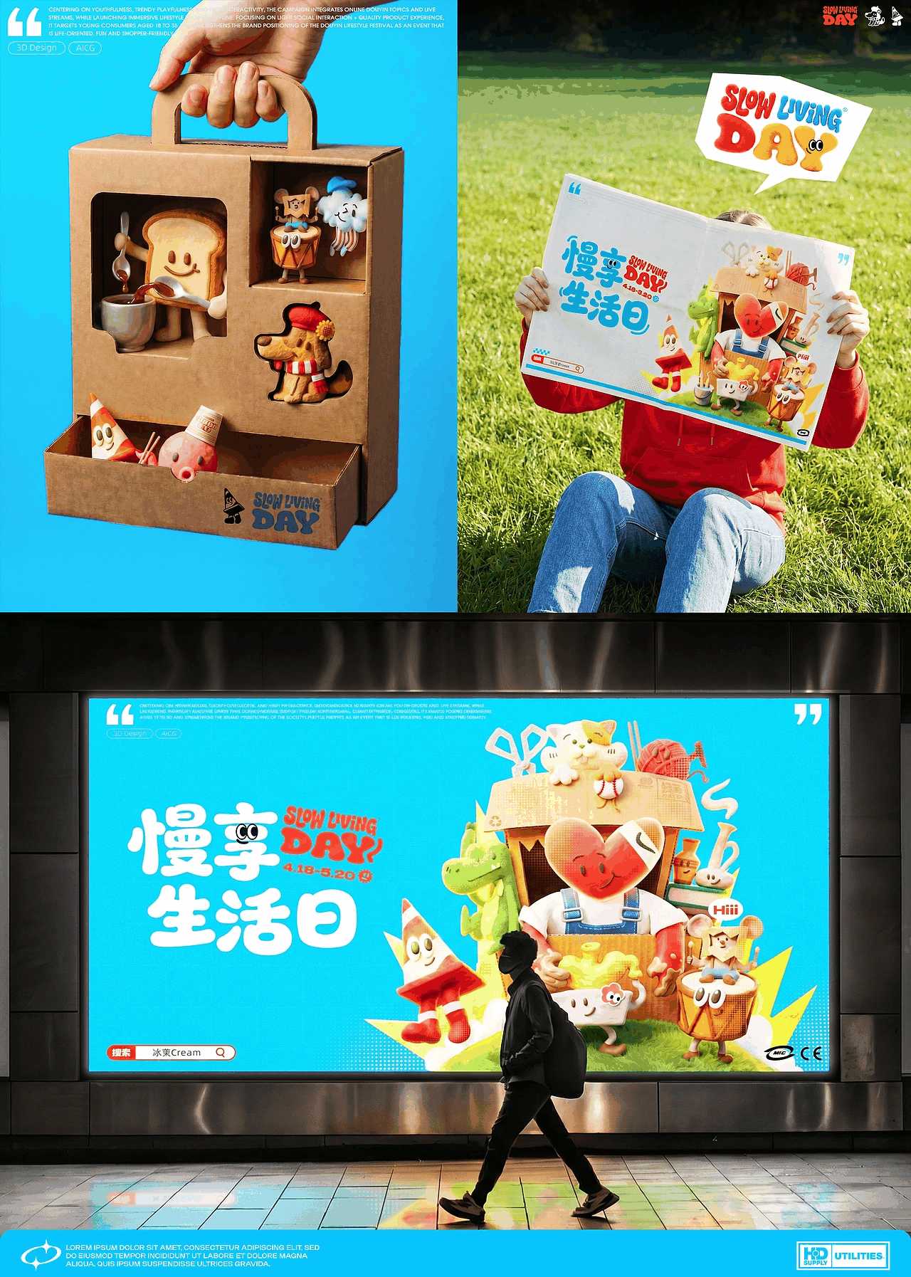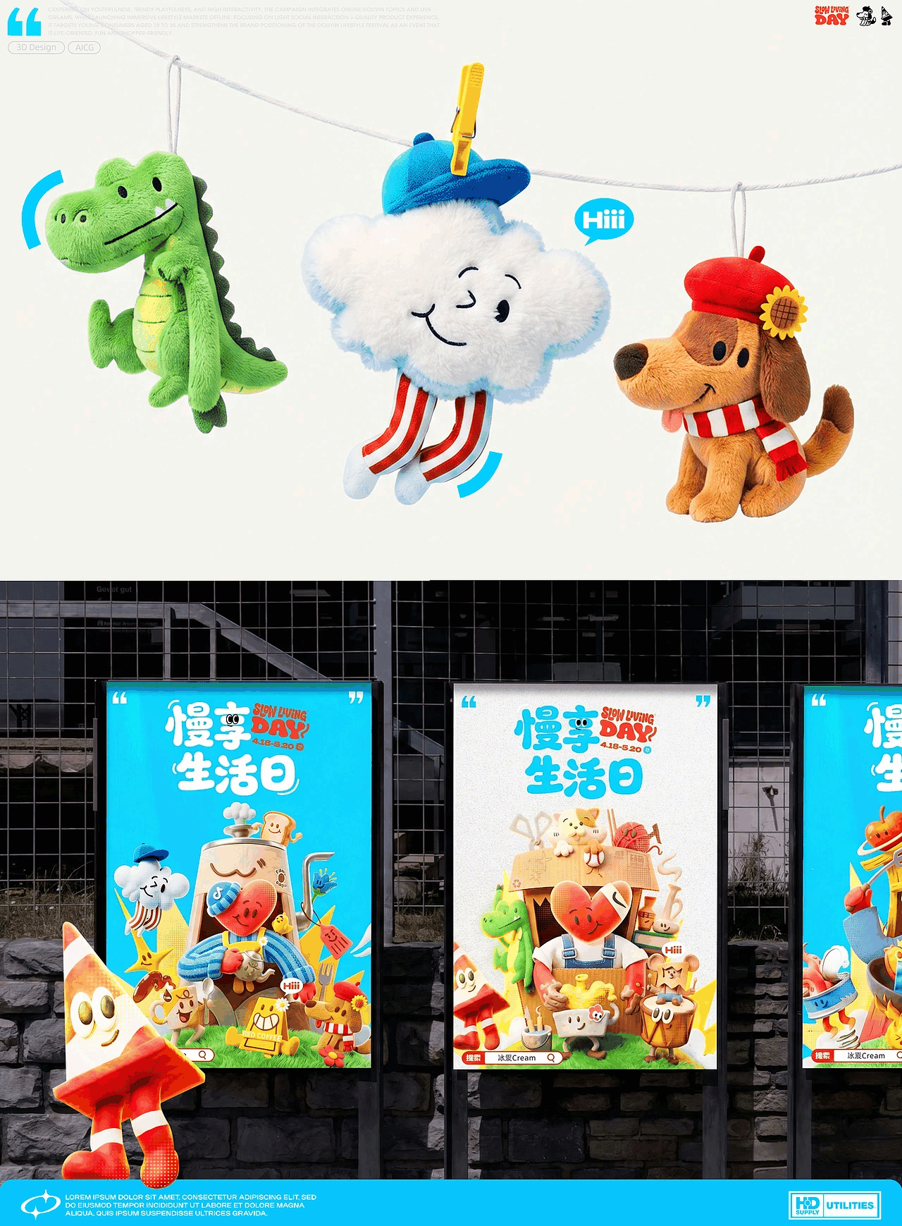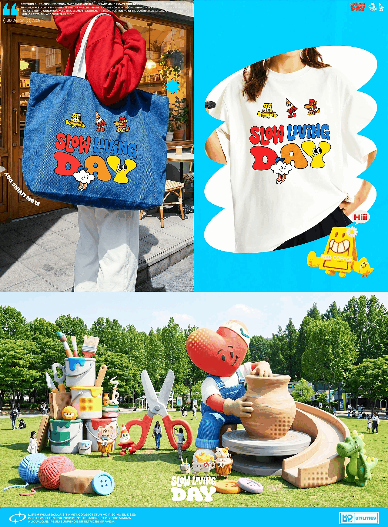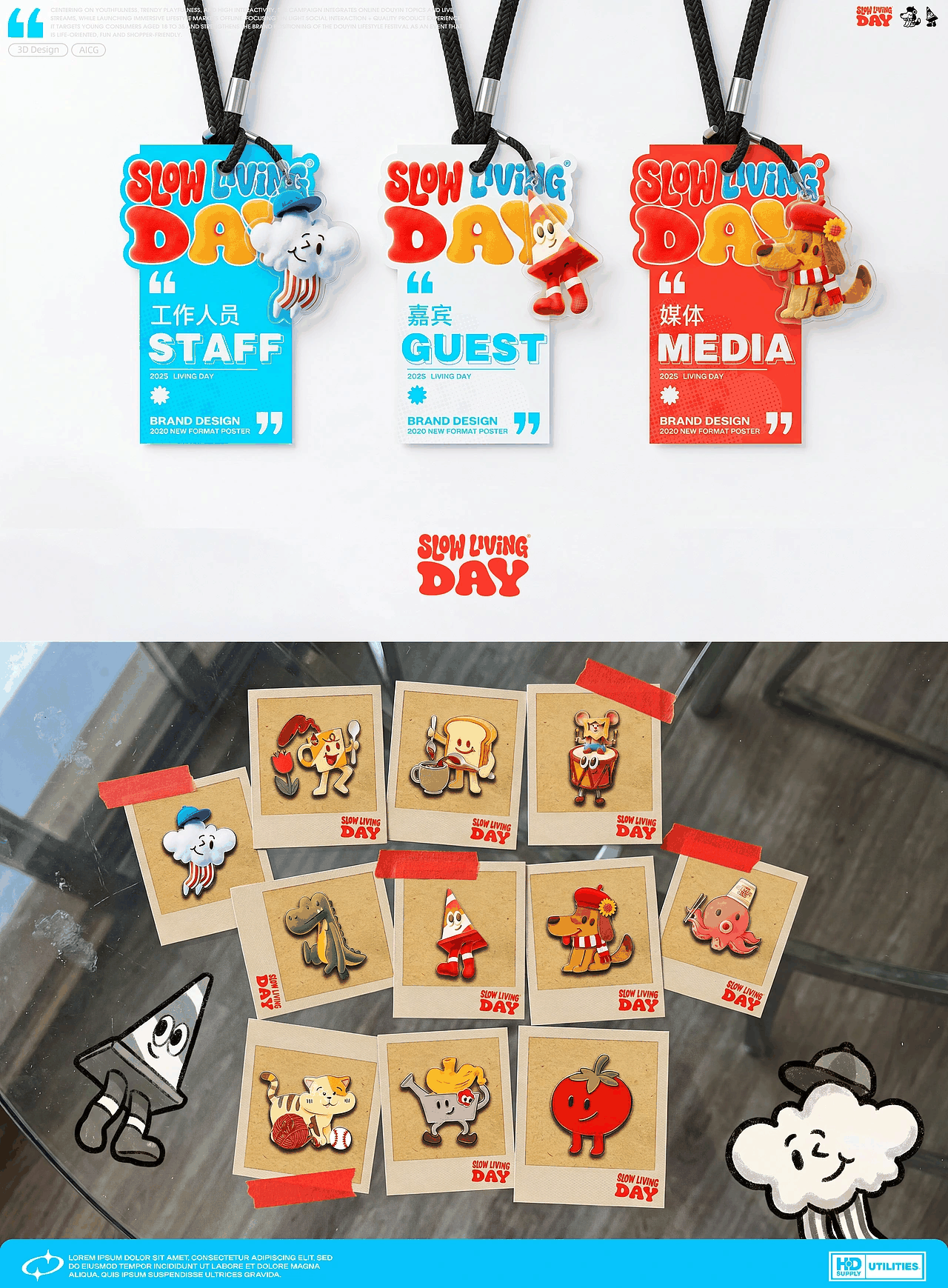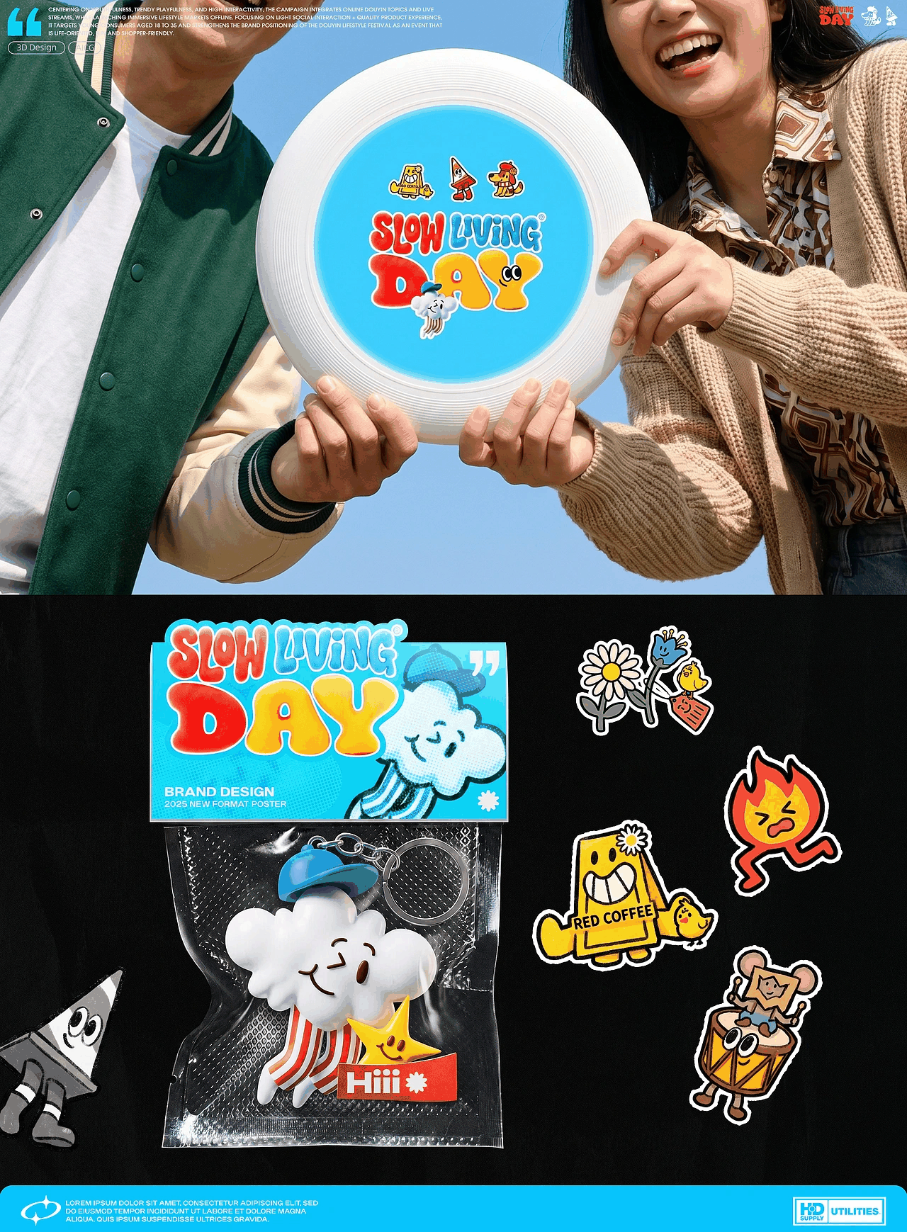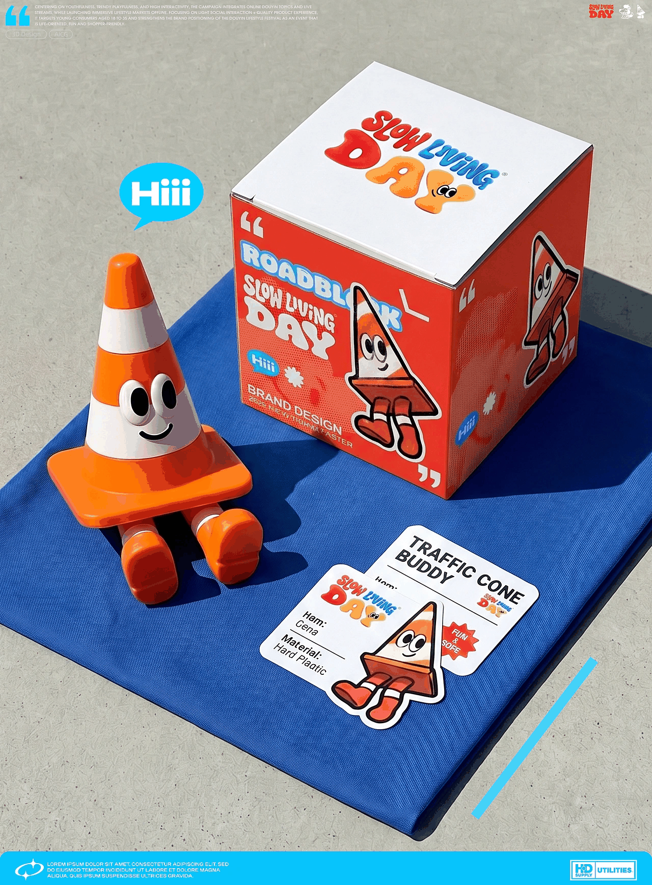
主视觉围绕“慢生活”核心
紧扣线下咖啡、美食、手工等生活摊位,以“物体拟人”卡通化为核心表现通过拟人化的互动细节(倚靠、点头、递道具)让静态画面变得活泼生动,避免慢生活主题的沉闷感整体色调统一为高饱和配色,既适配慢生活的治愈调性,符合传播的视觉需求。又通过统一的创意风格、拟人逻辑,形成系列感,精准传递生活节“线下慢生活市集、沉浸式治愈体验”的活动核心
Centering on offline lifestyle stalls featuring coffee, delicacies, handicrafts and more, the design adopts object anthropomorphism cartoonization as the core expression form. Anthropomorphic interactive details—such as leaning, nodding and handing props—vitalize static visuals and avoid the dullness often associated with the slow-living theme.
The overall color palette adopts high-saturation tones, which fit the healing vibe of slow living and meet visual communication needs. Meanwhile, the unified creative style and anthropomorphic logic create a strong series sense, accurately conveying the core positioning of the lifestyle event: an offline slow-life market with immersive and soothing experiences.